Link to my LinkedIN.
https://www.linkedin.com/in/sophie-neerup-larsen-45b01990/
Hire Me
My name is Sophie, and I am a Ui & UX designer from Copenhagen Denmark, I am looking for new exciting challenges!
sophienlarsen@yahoo.dk
Case project using UX design

Designing a smoother experience for customers inspecting their new ride
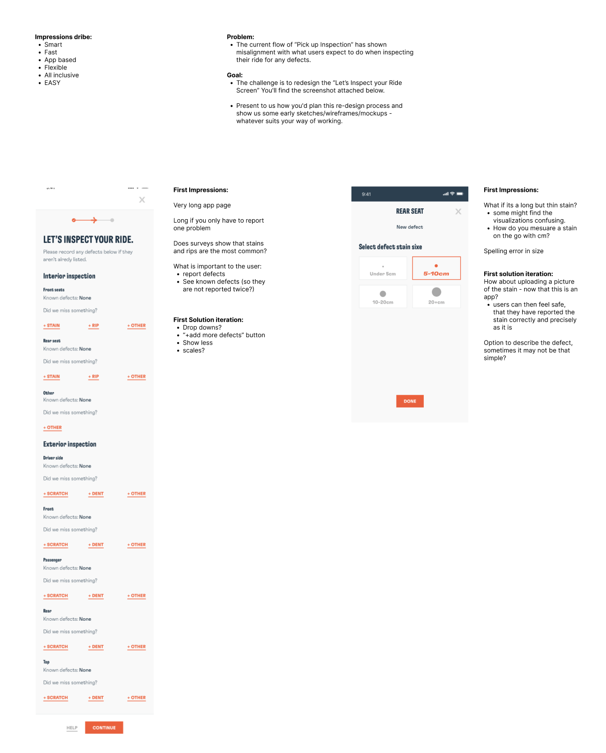
Dribe is in the process of transforming into a tech-driven company, aiming to create fully digital and automated mobility solutions for private (and eventually business) customers in Denmark. As part of this transformation, the “Pick-Up Inspection” flow — where users inspect their car for damages upon collection — was identified as a pain point.
The existing flow created confusion and misalignment with what users expected during this step, leading to unnecessary support cases and reduced trust in the digital journey. The goal was to redesign this experience to make it more intuitive, guided, and aligned with user expectations.
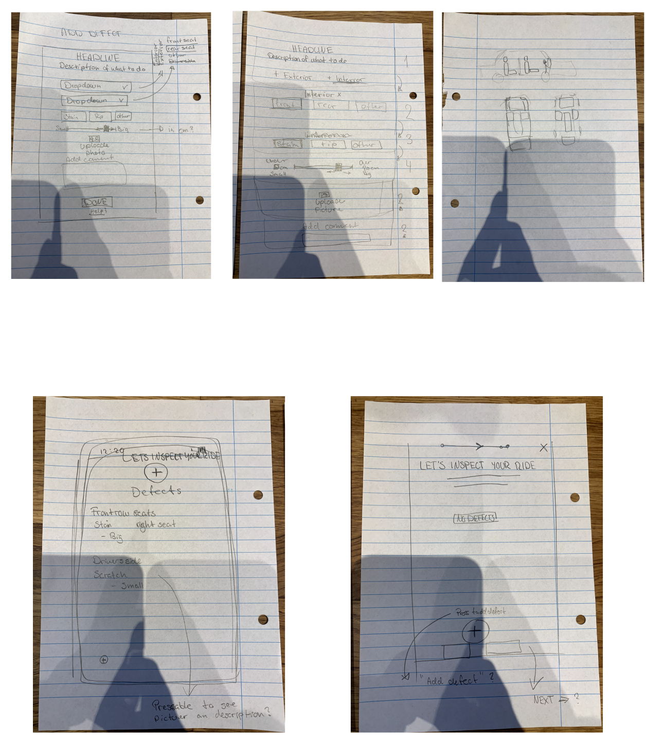
Though no direct interviews were conducted at this stage, I gathered insights through:
The target user is:
The journey was mapped from app notification → arrival → inspection → confirmation, focusing on mental and emotional touchpoints.
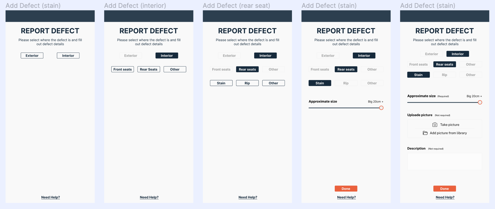
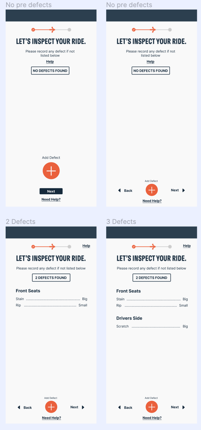
The redesigned UI featured:
Everything was implemented within Dribe’s design system to ensure consistency across the app.
Small UX decisions in operational flows can have a big impact on brand perception — especially in mobility services.
The target user is:
The journey was mapped from app notification → arrival → inspection → confirmation, focusing on mental and emotional touchpoints.