UX Design
Context & Objective
During my time as a UX Designer at Delegate, I worked on several SharePoint-based intranet projects for clients in both the public and private sector.
These projects focused on improving internal communication, simplifying navigation, designing custome solutions, and enhancing the employee experience.
Each intranet had its own audience and organizational culture, which required tailored design choices — yet they shared many of the same structural and usability challenges..
My Role
- UX Designer and facilitator across all three projects
- Responsible for identifying user needs and pains, design systems, wireframes, navigation flows and content structuring
- Worked closely with developers and clients’ internal teams
- Led workshops to understand user needs and define requirements
- Delivered high-fidelity designs in Figma ready for hand-off
Shared Challenges Across Projects
- Overwhelming information density and poor findability
- Lack of visual hierarchy in navigation and content
- Difficulties in engaging employees across departments
- Limited consistency in layout and tone-of-voice
Project Breakdown
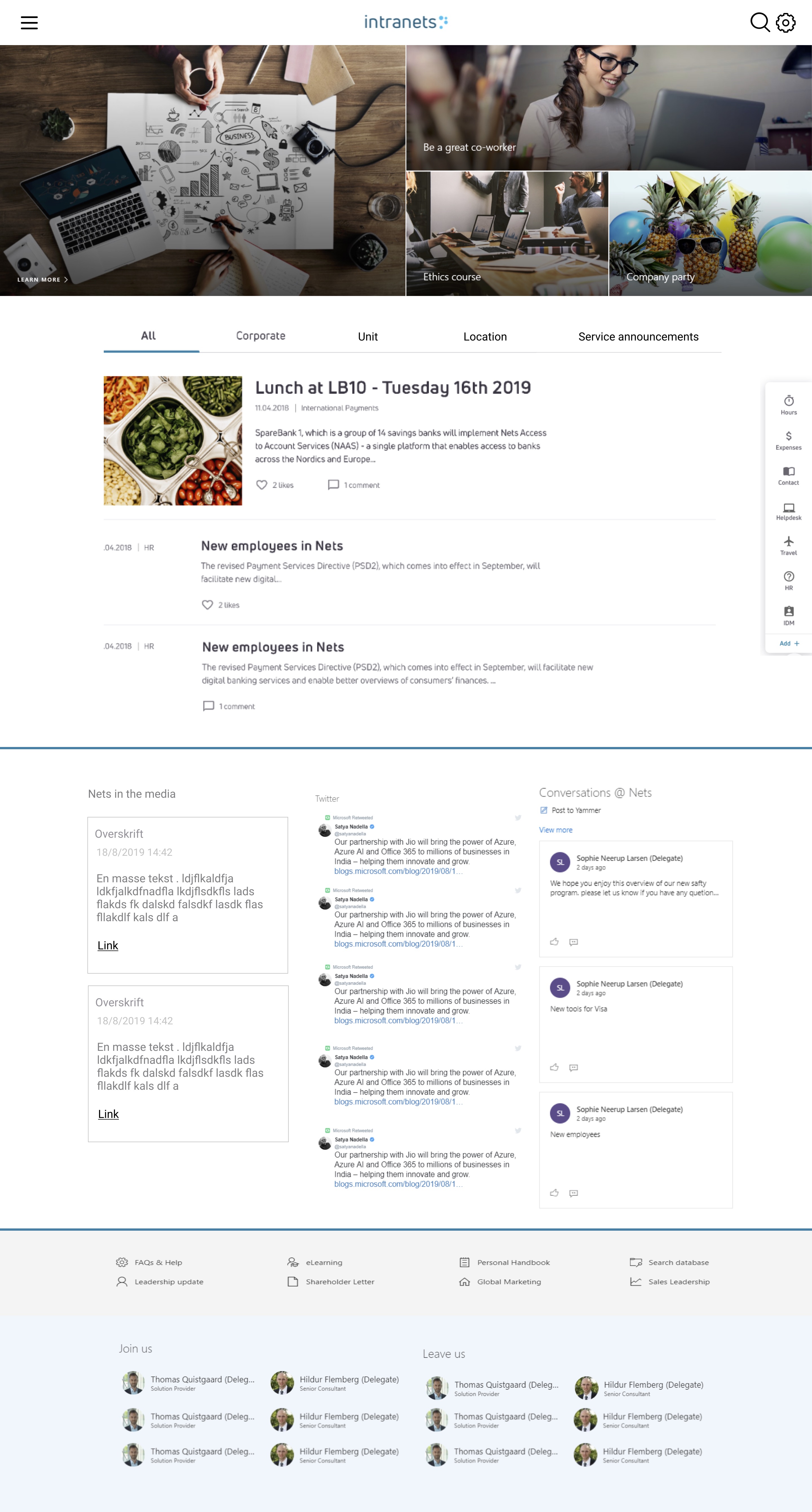
Project 1: Nets SharePoint Intranet
Goal:
Create a branded and intuitive intranet that could be used across countries and departments, focusing on accessibility and daily use.
Highlights:
- Custom-designed homepage widgets and navigation menu
- Focus on quick access to tools like HR, Policies, and IT Support
- Used card-based UI patterns for announcements and news
- Designed with mobile responsiveness in mind
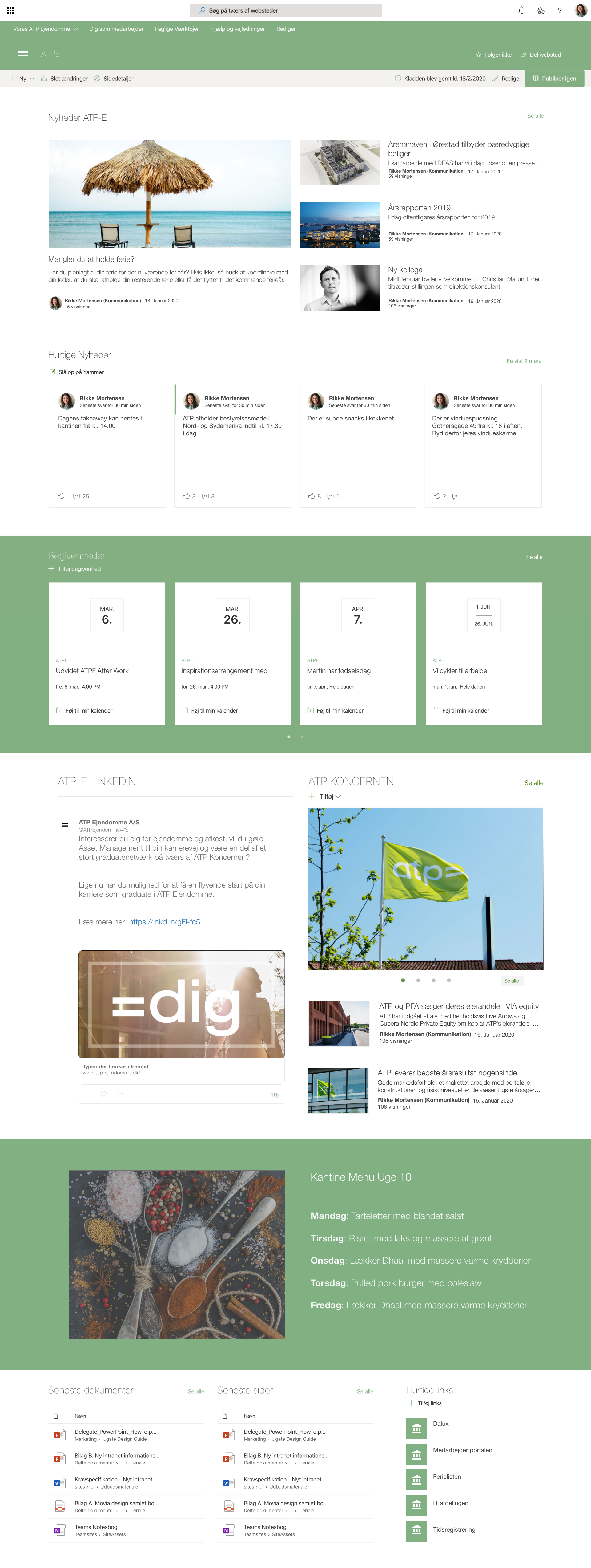
Project 2: ATP-E Intranet Redesign
Goal:
Restructure an outdated intranet to better support employees’ daily tasks and knowledge sharing.
Highlights:
- Improved structure through a reorganized information hierarchy
- Used personas to support decision-making (e.g. “Case Handler”, “Admin Staff”)
- Created a modular page layout for department-specific needs
- Simplified language and visual elements for clarity
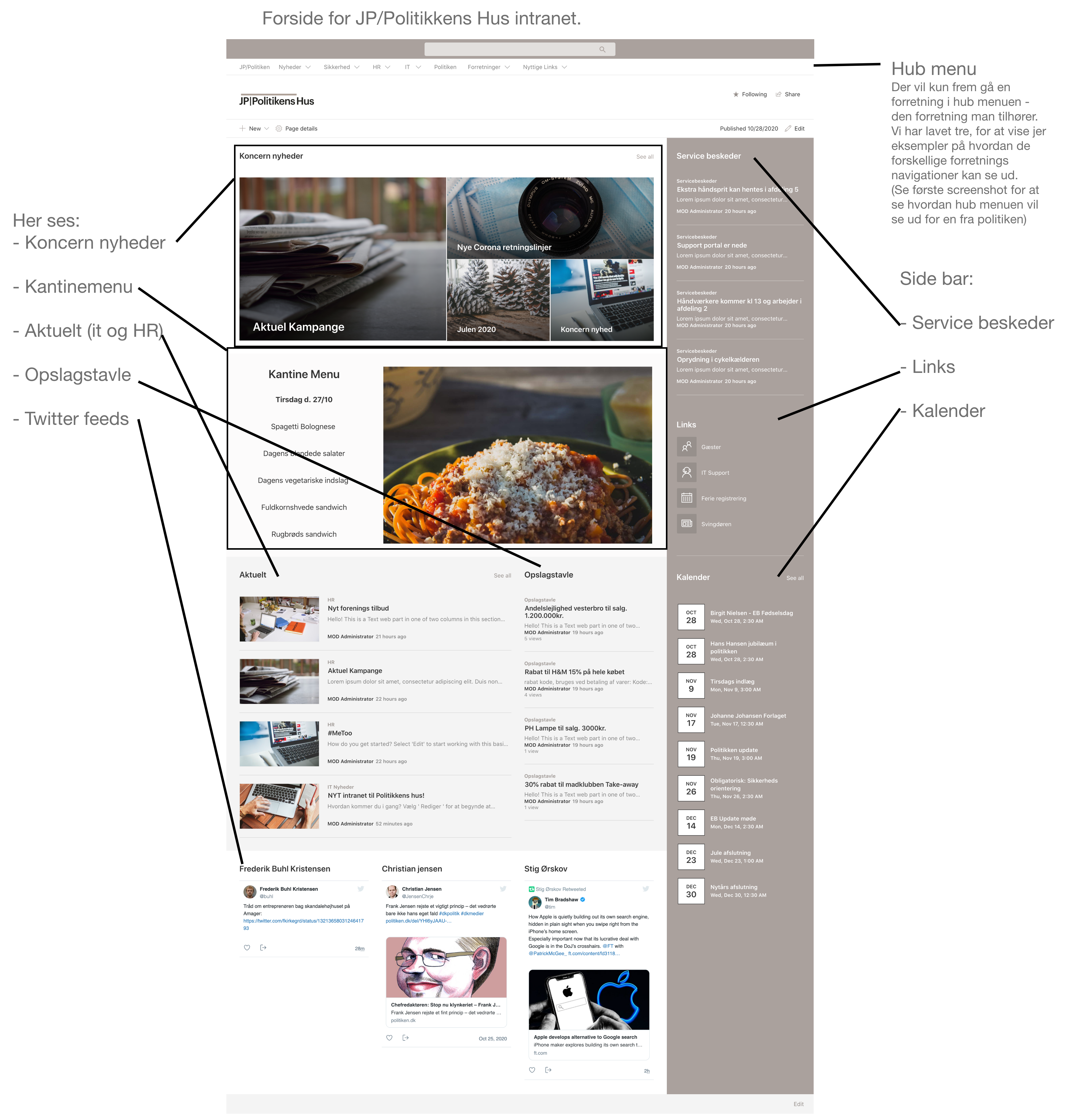
Project 3: Internal HUB Menu
Goal:
Design a minimalistic internal tool menu to quickly access key internal systems and documentation.
Highlights:
- Fast-access launcher with a clear visual icon grid
- Grouped tools by role and frequency of use
- Low-complexity UI designed for speed and simplicity
- Ensured accessibility and keyboard navigation
Shared Learnings & Reflections
- Consistency across navigation and structure is more valuable than aesthetics alone
- Internal systems benefit greatly from user-tested IA and naming conventions
- Early involvement of stakeholders improves adoption and reduces rework
- Minimalism is powerful — especially in fast-paced work environments
Tools Used
- Figma (wireframes, UI components, mobile design)
- SharePoint Online & SPFx design constraints
- Miro (workshops and architecture planning)
- Notion (internal documentation and feedback)