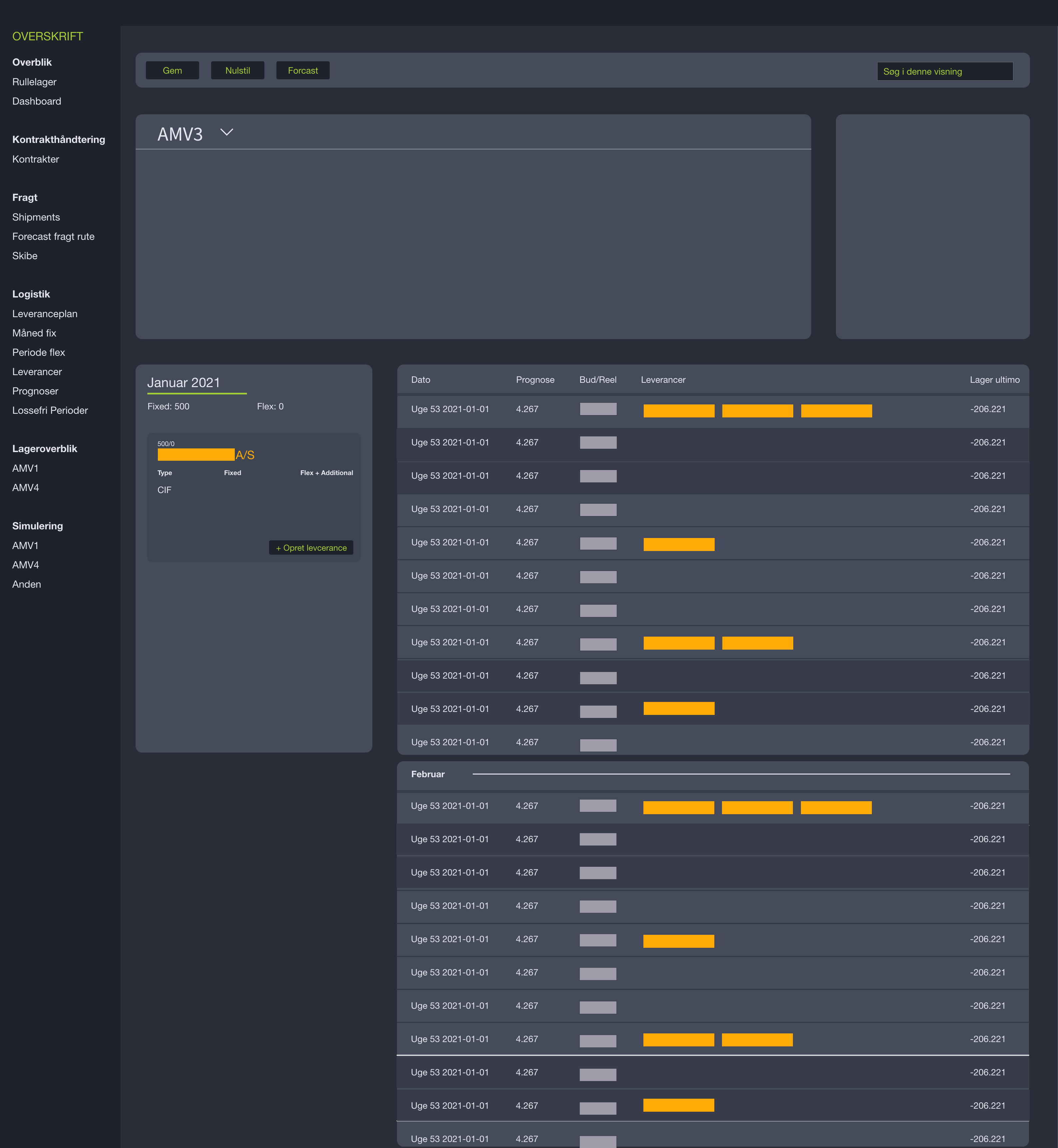
Enhancing usability and aesthetics through rapid UX/UI improvements
Context & Objective
The client had an existing stock simulation tool, developed internally at Delegate, that worked functionally but lacked visual appeal and user-friendly interaction.
I was brought in to redesign the interface, focusing on small but high-impact changes that would improve both the user experience and visual presentation without requiring a full rebuild.
The objective was clear:
- Improve the overall design look and feel
- Identify “quick wins” to enhance usability
- Deliver a more modern and intuitive interface through light-touch redesign
My Role
- UX & UI Designer
- Conducted lightweight usability testing
- Created wireframes and mockups for suggested improvements
- Delivered new interface concepts for implementation by the internal team
User Research
Since the tool was already in use internally, I was able to:
- Conduct user testing sessions with current users of the simulation tool
- Observe how they interacted with the interface
- Collect qualitative feedback on pain points and what they found confusing or visually unappealing
- Combine this with heuristic evaluation to identify clear UX gaps
Personas & Journeys
The main users were:
- Internal analysts and consultants using the tool to simulate stock flows and outcomes
- Needed clear, readable visual feedback
- Wanted an interface that felt modern and professional, but stayed functional and simple
The user journey focused on:
Launching the simulation → configuring variables → interpreting results
Design Solution
All changes were designed to be lightweight and easily implementable by the dev team.
The new design concepts included:
- A fresh UI with improved color usage for clarity
- Better structure around form fields and simulation parameters
- Consistent button styling and call-to-action placement
- Mockups showing multiple layout variants to support developer flexibility
- Enhanced visual feedback once a simulation was complete
Outcome & Learnings
- Delivered refined UI mockups and structure suggestions to internal developers
- Users responded positively to the simplified flow and improved visuals
- Reinforced that small UX changes can lead to meaningful usability gains — even in niche internal tools
Design doesn’t always require a full rebuild — thoughtful improvements can go a long way.
Tools Used
- Figma – Wireframes, mockups, and visual design
- Miro – Feedback mapping and prioritization
- Notion – Design rationale documentation
Wireframes for order page