Internal Order Page for Employee Purchases

Made in connection with employment with Delegate.
Image Billede 2

Designing a dual-option ordering system for internal use

Context & Objective

The client wanted to develop an internal web-based order page that enabled employees to purchase items using one of two benefits:

  • Receive 3,000 DKK of credit to spend freely, or
  • Forego the credit in exchange for a 50% discount on purchases.

The primary goal was to build a clear and intuitive user experience that guided employees through the decision-making process and ensured the ordering logic was transparent.

Additionally, item information had to be presented in a way that was both visually digestible and informative, while allowing users to compare and make confident decisions.

My Role

  • Lead UX & UI Designer
  • Responsible for designing the end-to-end user flow
  • Created wireframes, mockups, and a clickthrough prototype
  • Ensured clarity in benefit selection and item presentation
  • Worked within visual identity guidelines, while adapting for clarity and usability

User Research

Due to the internal nature of the platform, research was based on:

  • Feedback from HR and finance departments (who managed the benefit program)
  • Observations and questions from pilot users
  • UX heuristics for choice architecture and e-commerce usability
  • Best practices in reward-based and benefit-based purchase flows

Journey focus:

Enters order site → Chooses benefit type → Browses items → Adds to cart → Confirms order

Design Solution

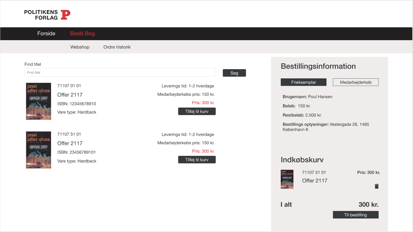
The final mockups featured:

  • A benefit-selection prompt at entry with clear explanations and visual cues
  • Modular item cards showing image, price, and detailed specs on hover/click
  • Real-time benefit usage tracker (e.g., “You have 1,200 DKK remaining”)
  • A responsive cart system that reflected the selected benefit logic
  • Visual consistency and intuitive navigation to support quick decisions

A clickthrough prototype was used to demo the design and walk stakeholders through the full flow.

Outcome & Learnings

  • The design was approved for development and adopted internally
  • Users found the benefit explanation easy to understand and felt empowered to use the system without external help
  • The flow successfully balanced functionality with lightness
  • Learned that even small logic decisions (like discounts vs. credits) need strong visual support to avoid friction

User empowerment often comes from clarity — not complexity. The right structure makes choice feel easy.

Tools Used

  • Figma – Wireframes, app design, interactive flow
  • Miro – Ideation and stakeholder mapping

Wireframes for order page